
Roles:
- Graphic Designer
Clarity is a quality of life app mockup designed to suit the needs of those with ADHD.
It was designed and developed as the final major project of my BA in graphic design and was directly informed by the research I had conducted for my dissertation, which focused on the strategies that London's design museum employs in order to be an inclusive and effective space.

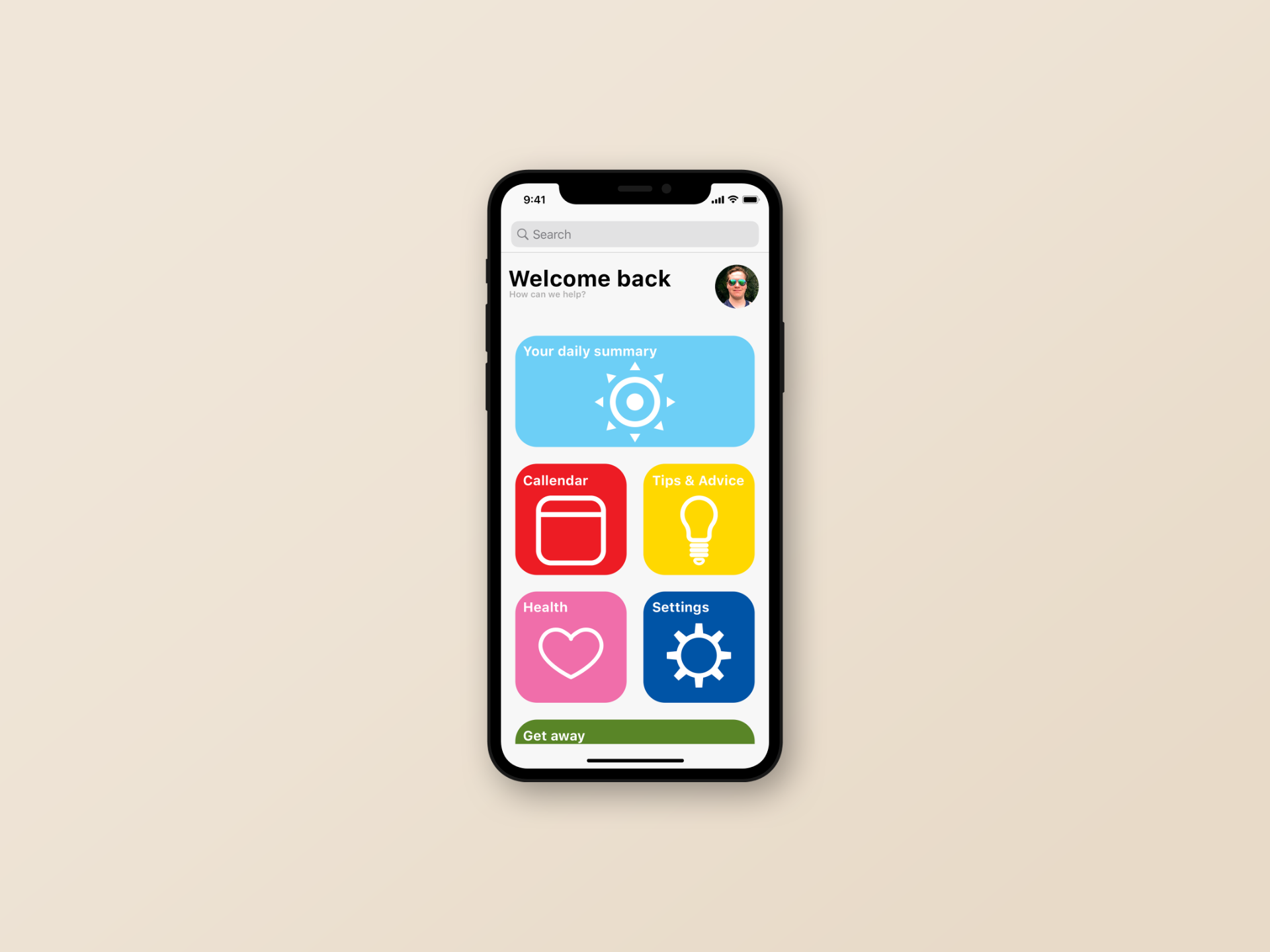
Clarity's UI was designed to match its name. Each section of the app is clearly defined with a strong, solid block colour and icon that makes it easy and quick to navigate.
People with ADHD are often easily distracted and tend to focus on things that are capable of grabbing, and holding, their attention. This is the reason the app uses a range of bright colours for its icons. It is immediately quite striking, but understanding what section of the app is represented by what colour takes mere seconds and is very easy to remember.
Branding

The branding of Clarity was, once again, designed with the concept of being as clear as possible.
The font chosen was Futura as it is a simple and easily legible typeface.
The icon can be broken down into 3 key elements.
- The outer circle - This represents the app's attempt to captivate the user's attention and help to keep them focused on what is important.
- The rectangle - This represents the phone or device upon which the app is being used.
- The inner circles - This represents the eye of the user, captivated within the app.
Together this represents the function of the app.
This particular shade of orange was chosen as it is the official colour of the ADHD awareness ribbon.


