
Roles:
- Graphic Designer
Brand Guidelines
2023 Brand Refresh
After nearly over 4 years of service, I decided my branding needed a slight refresh.
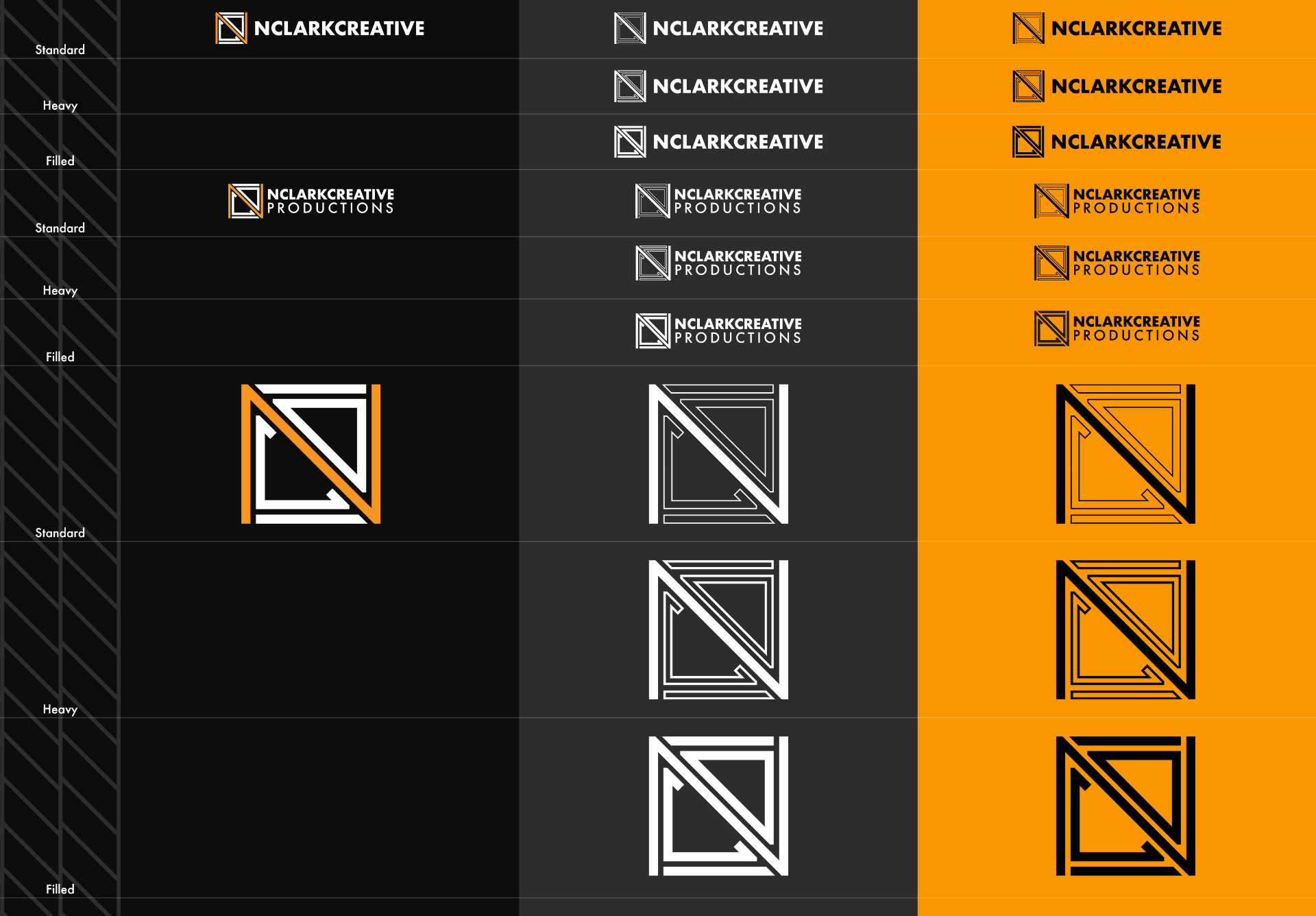
I felt that the logo, specifically, could be improved as the existing version lacked the capacity to function in a monochromatic environment - the N in the logo simply disappears as it merges with the bounding box.
It was this desire for more versatility which inspired the decision to simply give the logo a minor tweak, and chop sections out of the outer bounding box so that the N would become entirely independent, thus creating a logo that works both in monochrome and in colour.


